Yes you're right, I am making another map, but I AM TRYING on this one, Blues gave me some help setting up the fade thing for the teleporter, and I'd say it's going nicely now.
Now as some of you may know, oc_Lived was a short map, and a similar map, oc_noise was also small. So I thought, why not connect them together? So I did.
Basically, the first part involves you taking a slightly longer way to work because you can't find your car or something.
The Second part involves you going home via your car which is in the car park of the Office area, you only have to get to it and get past the large spider in the way.
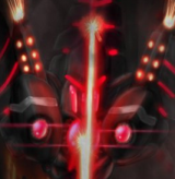
Now that you understand, I'm going to post some pictures of the map.


Now, if you remembered the old Lived and Noise, please make some suggestions for me to include in this version.
Current To Do List:
Redo Geography in starter area. (5%)
Table (Done%)
Outside at the end (30%)
Lighting in general (30%)
Constructive Criticism or Go away.
(Also the pictures apart from the one with the Big Momma in are done when I play OC on fullscreen mode, thus making it super huge and ugly.